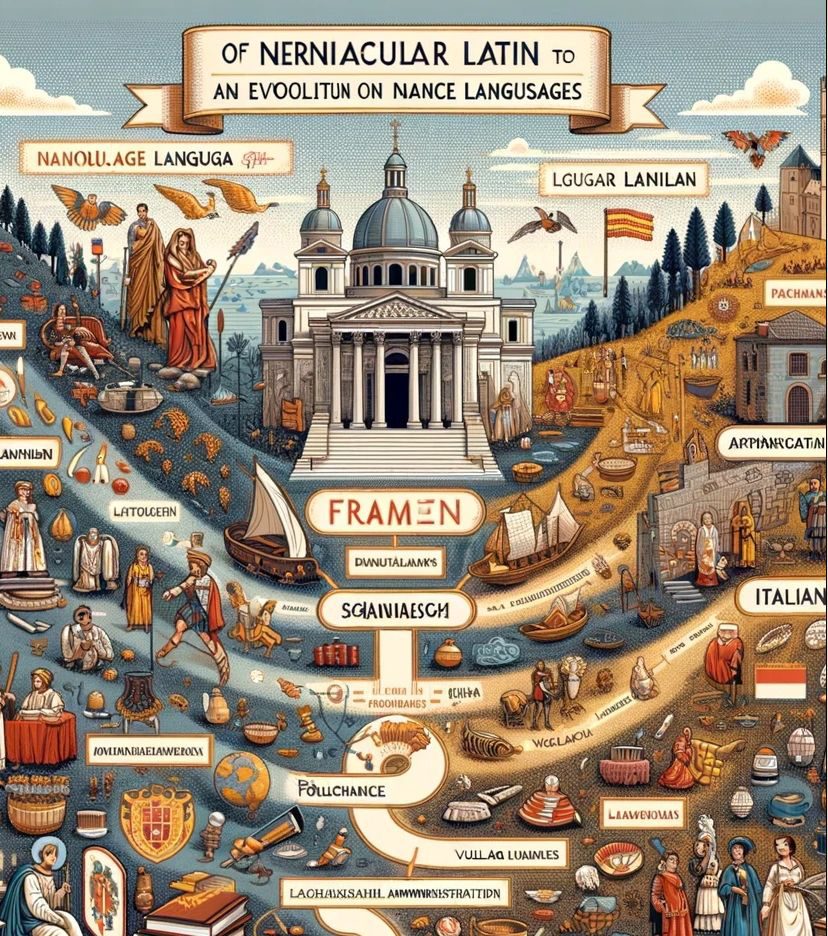
Image courtesy of UCLA’s website, but since AI-generated art can’t be copyrighted, maybe this acknowledgment doesn’t matter.
UCLA announced the other day that “Comp Lit 2BW will be the first course in the UCLA College Division of Humanities to be built around the Kudu artificial intelligence platform. The textbook: AI-generated. Class assignments: AI-generated. Teaching assistants’ resources: AI-generated.”
The professor’s explanation of why any of this is good doesn’t make any sense to me — she seems to be describing standard teaching practices like discussing texts and putting together a syllabus, but now AI is involved. Which to me always feels like a looming labor issue — I wouldn’t be shocked to see this software cited as justification to fire professors or TAs, or reduce their pay.
Because again, I can’t make sense of how this is supposed to be innovative:
“What’s amazing is that this takes a general education course from being about information overload to being much more about helping students find a through line and key themes over the course of 10 weeks,” Landers said. “Now, instead of a professor lecturing about historical facts — because those are all in the textbook — they can instead focus on things like, ‘How do we think about this particular text?’ and ‘How can we think about it differently?’ And that’s how critical thinking starts to happen.”
Sounds like teaching? I’m really struggling to see how this as anything more than a stunt-y gimmick, and based on how often the AI software brand is mentioned, I have to imagine some money is exchanging hands here.
Why don’t students switch on their own AIs to read and summarize the AI-generated textbook, reply to the teaching AI’s questions, answer any AI-worded writing prompts, and generate a final paper? That way, everyone can just go home and we can check in on what was learned at the end of the semester.
But what really got me fuming was the horrible, horrible textbook cover that was extruded for this course.

This image is for a book that’s apparently called History & Fiction: Survey of Literature from the Middle Ages to the 17th Century, but you won’t find those words on the book’s cover — already this AI is failing at a basic job. The AI decided to put some letter shapes in the spot where we might find a title that look like “Of Nerniacular Latin to An Ecoolitun on Nance Langusages”. Not even close!
The images are even worse. A Greco-Roman revival building sits between two grainy hills, while rivulets of faded blues, browns, and yellows flow down like sewage spills, carrying along all sorts of unintelligible debris and pixels.
Floating awkwardly above this sludge are melted saints and smudged Rennaissance-esque folks, crowded out by processions of object-shaped blobs: a stack of pancakes made with drywall dust and covered in syrup, a banana in a custom leather scabbard that’s sealed with a watch, a crab’s legs peeking out from under a purple Victorian lampshade.
But since this is a comp-lit course, there’s some attempt at a flow chart thrashing its way through this yard sale of Cronenberg rejects. Two unseaworthy boats pour streams of golden piss into a word box labeled “Sgiaiviaescm” which leads to “Frodiidawes,” two unforgettable movements in literary history, I’m sure. This history doesn’t last long though, as they’re blocked from developing further by the curling procession of “Poiuchance” morphing into “Vuilao Luainles,” a process that is hindered or aided by a croissant that someone tried to play like an accordion and then abandoned, right in the middle of the flow of literature’s evolution.
Somewhere out there, as always, is “Italian.”
And way off in the background, a pale creature appears to have been bled dry and impaled on a pole on an island, forgotten and forsaken in the sea, a creature which I take to represent the ideal audience for this image.
It’s not all bad: I’m glad to see what looks like the Catalan flag flying proudly over all of medieval literature.
This cover looks like dogshit, no two ways about it. It’s not interesting at all, and looking at it makes me feel like I’m drunk at a bookstore, trying to make sense of a large-format children’s book. And I don’t mean “drunk in a bookstore” in a fun, flirty way; I mean it in a sad, this-is-your-rock-bottom, change-your-life-now-or-never way.
This cover sucks, it’s so bad. Have some dignity people, we don’t have to live like this.

