August 23, 2024, 1:57pm
Image from The J.D. Salinger Literary Trust, photographed by Vincent Tullo for The New York Times.
I hadn’t considered the famously spare J.D. Salinger rainbow cover in a long time, but this post by writer Austin Adams came across my feed the other day:
I had always figured Little, Brown carelessly threw together this design. Today I learned that Salinger drew it himself. pic.twitter.com/pBvUbBknsh
— Ada(ms) or Ardor (@AdamsOrArdor) August 22, 2024
I also had no idea—Did everyone know this? What else are you all hiding from me? The story tracked for me: I had always heard that Salinger was finicky, but just how demanding was J.D.? I did a little digging and found out that he was very demanding.
Kenneth C. Davis has some great details on Catcher in the Rye‘s design history in his book on the history of paperbacks called Two-Bit Culture, which he quotes from on his blog. Davis recounts how Salinger was unhappy about the design of the initial Signet printing and its illustration: “He said he would be much happier if the book had no illustrated cover at all. In fact, he would be happier if the book was distributed in mimeographed form.”
The next printing attempted to assuage the author, adding a painting by James Avati of Holden Caufield in his red cap on the streets of New York. But Salinger didn’t like this either, so when the book’s license was being renewed, Salinger, now a famous best-seller, again asked for changes:
We shook hands on a two-cent-per-book royalty and Arthur then told me that Salinger had to approve the cover. I said, ‘Anything he wants. We’ll do it on plain brown paper.’ Salinger actually sent us a swatch to show us the color he wanted. He even selected the typeface. The J and the D were set in different types.”
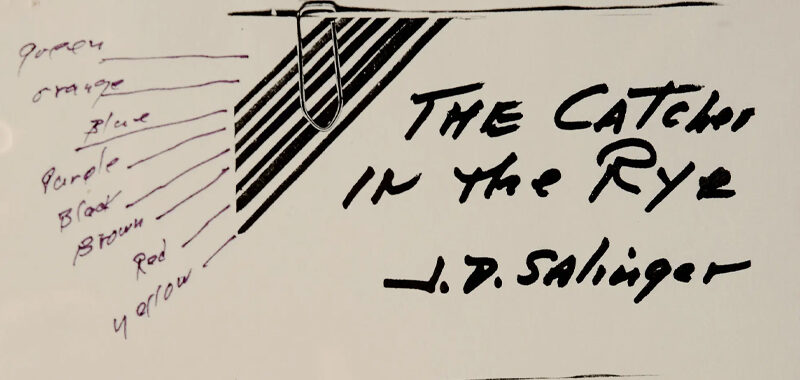
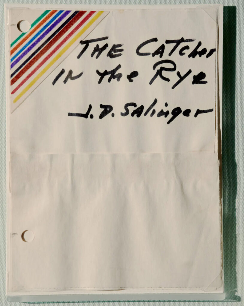
But Salinger was still unsatisfied. Years later, he had a new idea for a simple cover with a rainbow in the corner, and once again sent some sketches along to his publishers. These design documents were on display at a New York Public Library exhibition of Salinger ephemera a few years ago, a show that included manuscript drafts, typewriters, a popcorn recipe, and sketches for the now famous covers, photographed by Vincent Tullo for The New York Times:
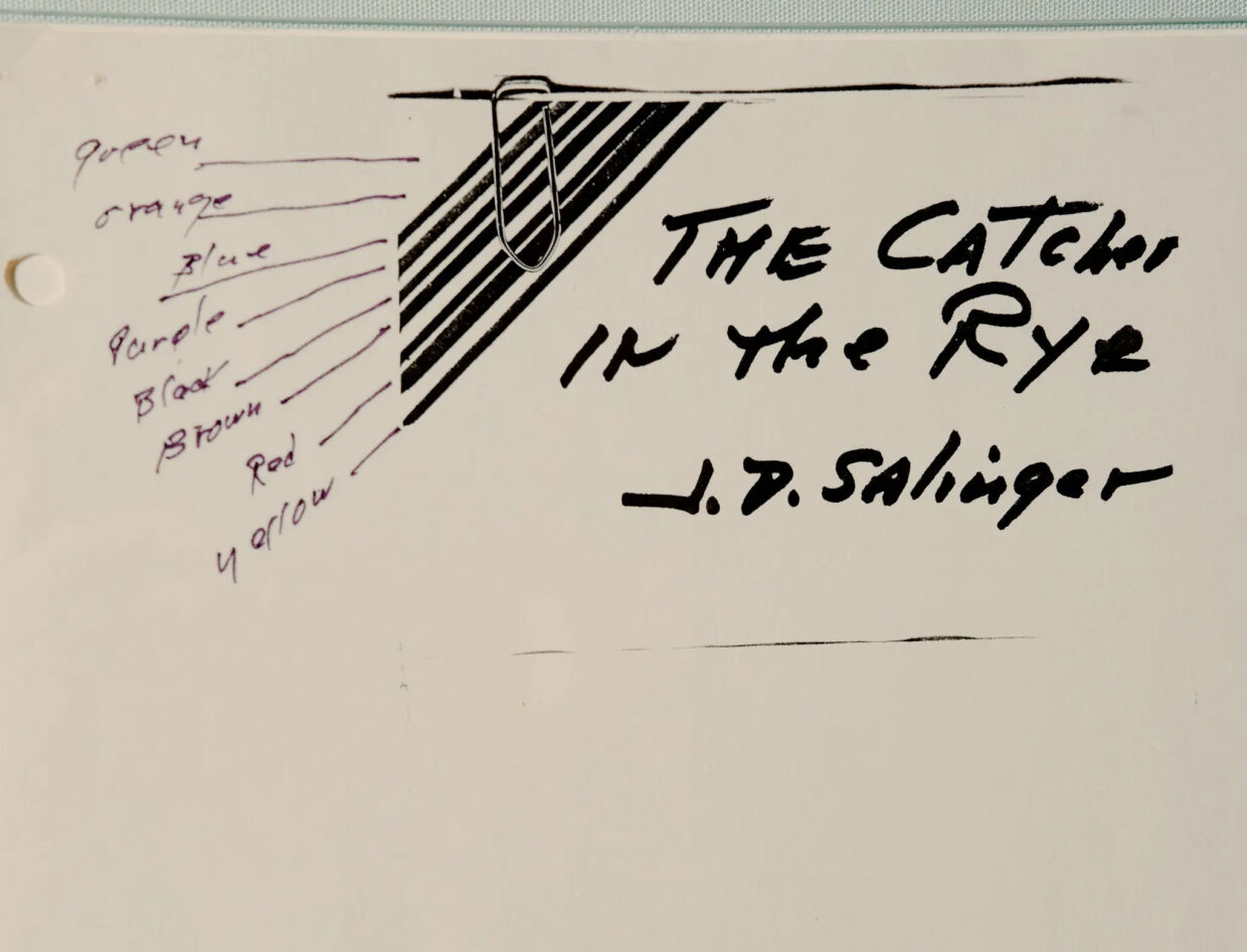
There was a note to go along with these designs too:
I would prefer, of course, that the title and author’s name be placed lower, more nearly centered on the cover than outlined in the attached sketch … Bantam thought my original mid-cover placement of the title for Franny and Zooey not suitable for ordinary sales-rack display. (So I added thin green parallel bars across lower third of the corner, to compensate for any imbalance, top-heaviness, or placing the title too high at the top. I think my vivid diagonal bars should carry things off nicely enough.)
The design was executed nearly exactly as sketched, and this copy is still on bookstore shelves today—it’s the copy I read in high school.
As a writer and designer, Salinger might be considered a writer-artist, who comfortably wore multiple hats. I do think Salinger did a nice job—though please correct me, real designers. But having read this long saga, I can’t help but think that these decades of design specs, and letters, and complaints to publishers, and complaints to agents are all a bit much. As much as I like The Salinger Cover, I also feel a lot of sympathy for all the publishing workers who had to deal with years and years of these very specific complaints.